← Kitchen Robot NowVISUAL ARTBOOK / 01—04AI-NATIVE ROBOTICS
VISUAL STUDIES / BRAND DIRECTION

Four ways to make specialty robotics feel inevitable.

These are exploratory image-generation studies for the landing-page language. The selected direction is Material Atlas: warm, tactile, rigorous, and open enough to hold both kitchen evidence and biology-lab ambition.
Swiss industrial design study
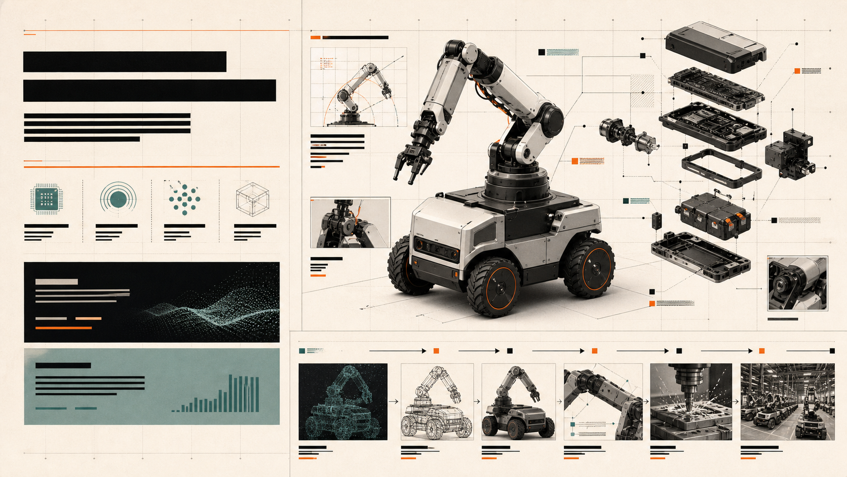
01 / SWISS INDUSTRIALPrecise. Modular. Evidence-first.

Strong when the company needs to communicate engineering rigor, modular systems, and a clear design-to-build sequence.

Soft brutalist design study
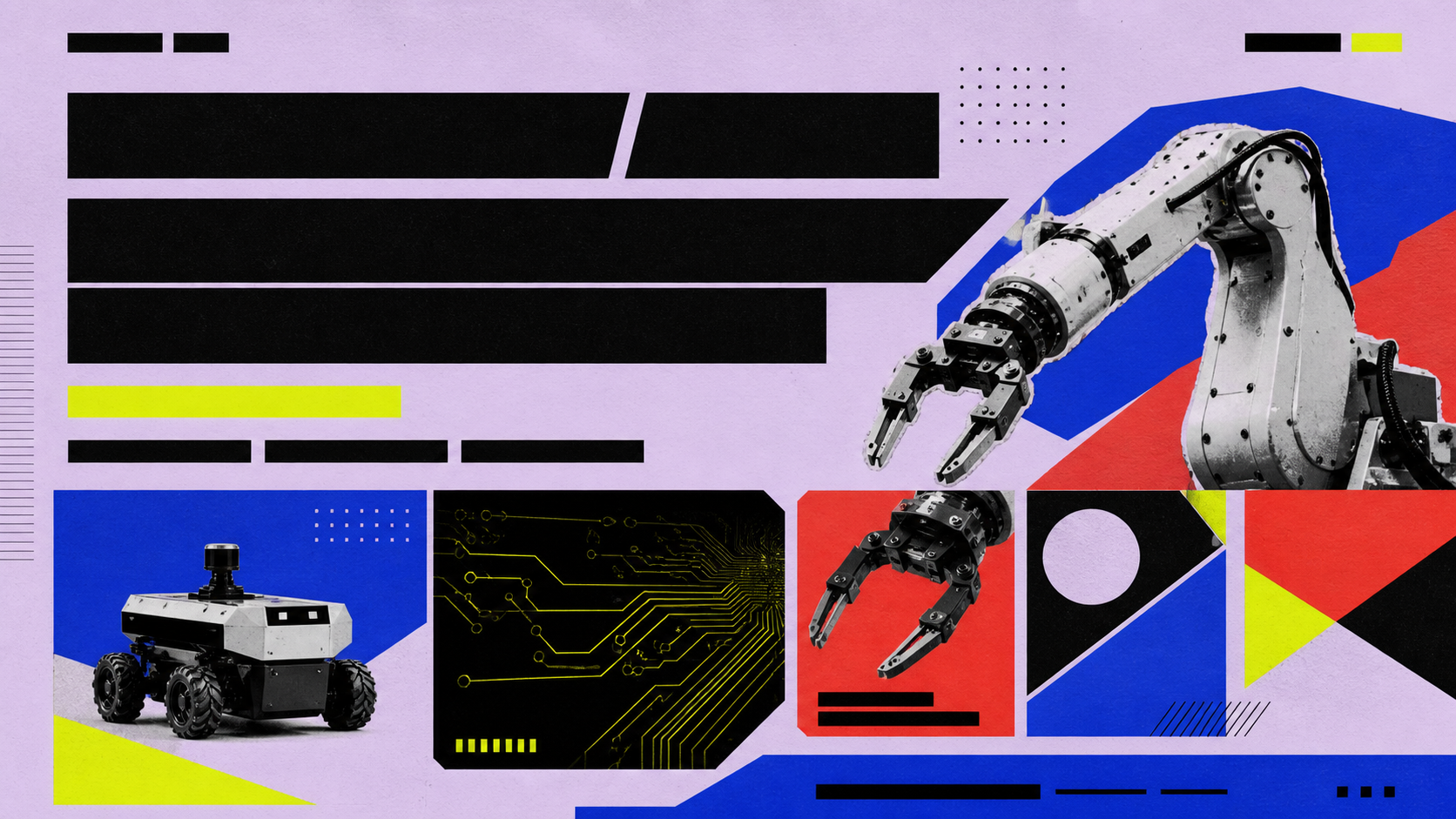
02 / SOFT BRUTALISTMemorable. Loud. Young.

Strong for a more disruptive, culture-forward brand, with more energy and less laboratory calm.

Dark kinetic control-room design study
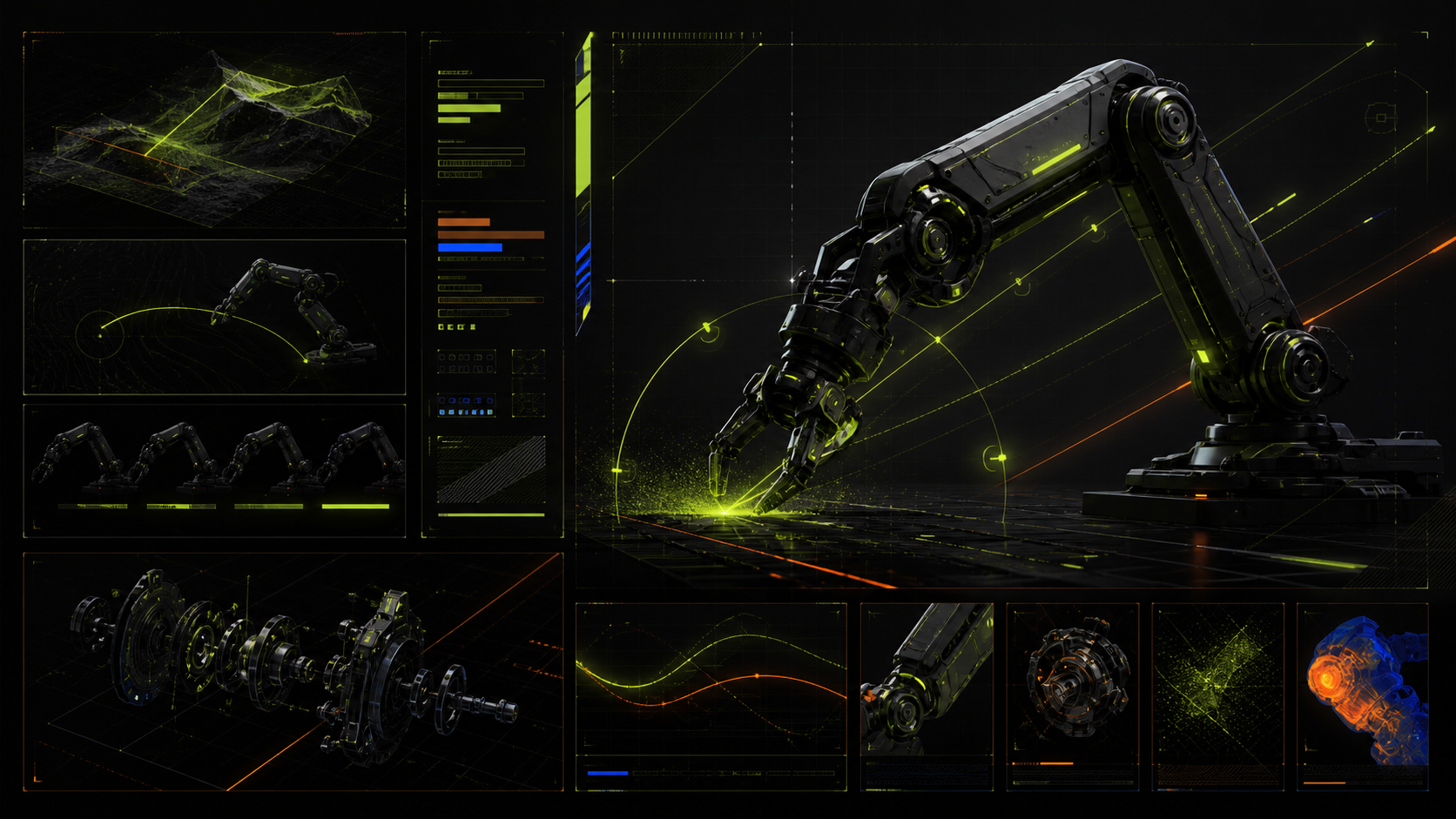
03 / DARK KINETICFast. Technical. High voltage.

Strong for a robotics campaign or product launch, but too close to generic cyberpunk for the company surface.

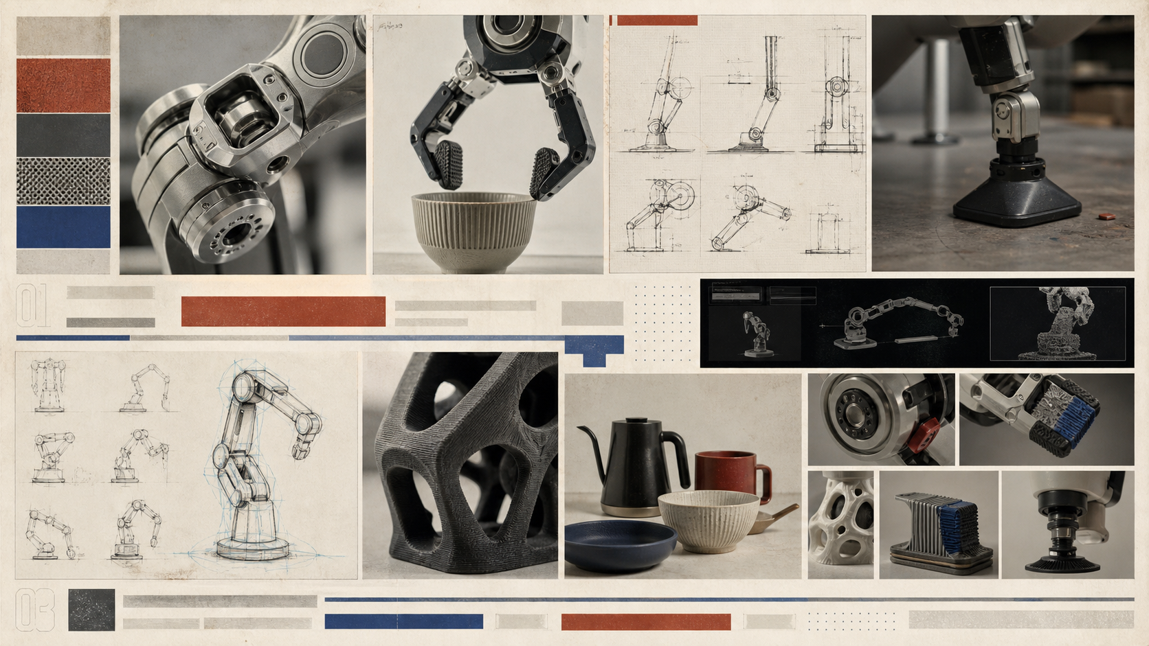
Material atlas design study
04 / MATERIAL ATLAS / SELECTEDTactile. Scientific. Adaptable.

The chosen direction: a design-research book that can move from machined parts to plates, lab benches, material swatches, and proof frames without losing its point of view.

THE DECISION

Use the material atlas as the company language.

It gives the promise room to breathe: specialty robots should feel affordable, fast to design, and grounded in the actual material world they have to work inside.

Return to the landing page ↗